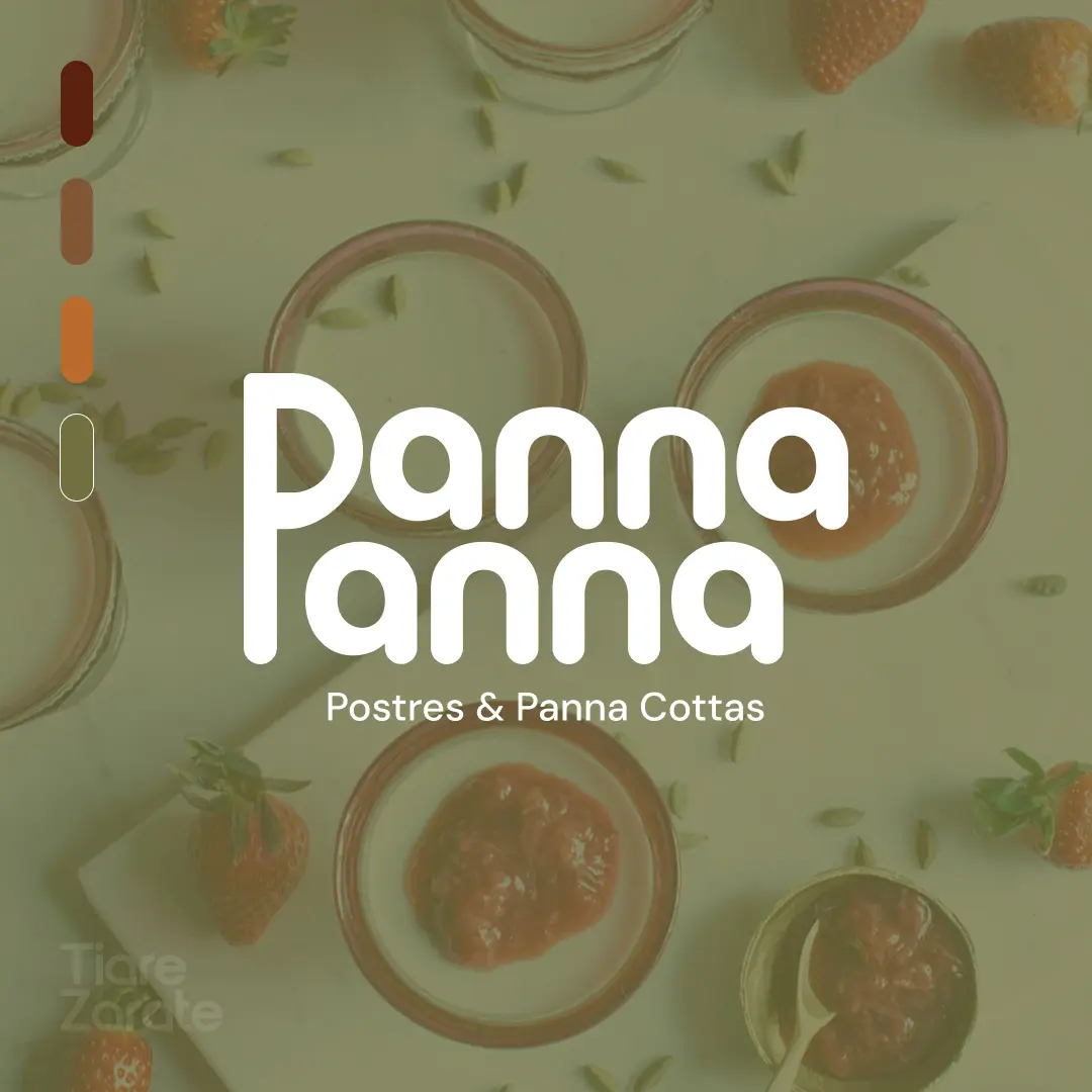
A branding project developed for a Mexican dessert brand specializing in panna cotta. The brand name brings together two words that share the same “P,” which inspired the visual identity. The rounded letterforms reflect the smooth, creamy texture of the dessert, while the monogram transforms the “P” into a playful melting drip.
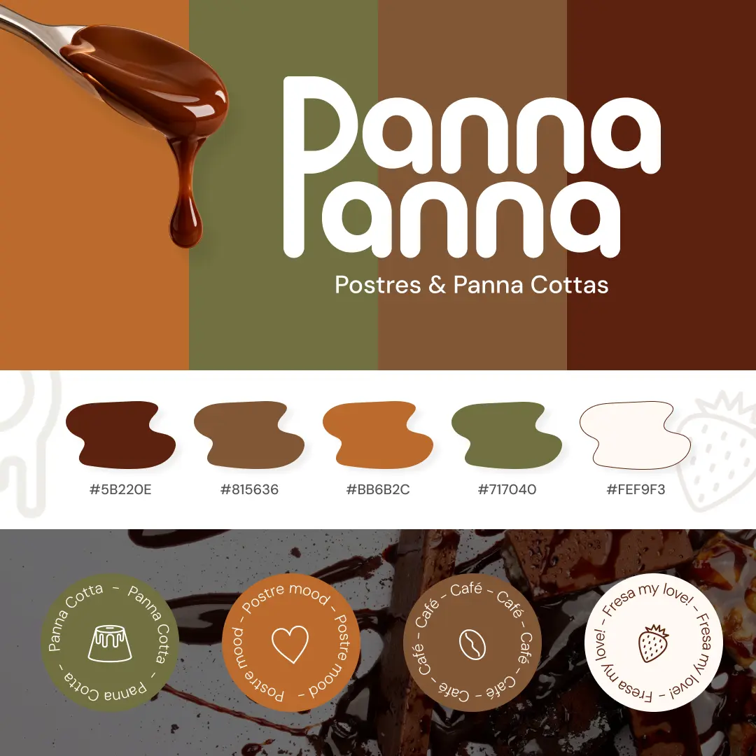
The color palette takes inspiration from chocolate, caramel, burnt orange, and olive, as well as the warm, earthy tones of Tuscany—a subtle nod to the dessert’s Italian roots. A soft cream base brings the palette together, while simple line icons and organic shapes give the brand a friendly, handmade feel.
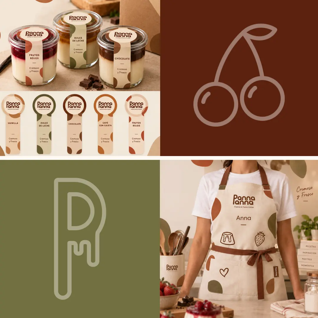
The final identity includes the logo, monogram, color palette, iconography, and packaging applications, including jar labels, stickers, and a branded apron.
Date: September 2026
Client: Dessert Brand
Services: Logo Design, Brand Identity, Packaging Design.
Tools: Adobe Illustrator