
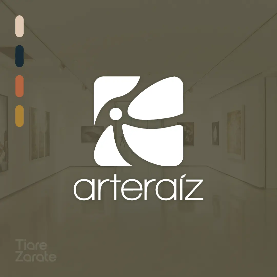
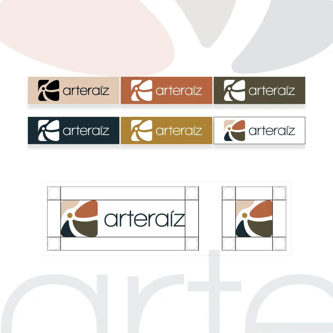
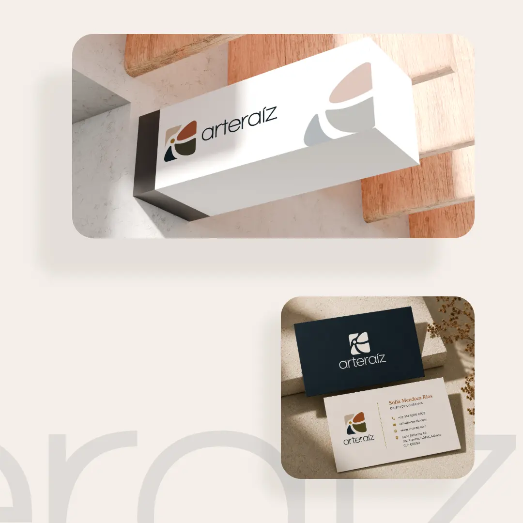
I designed the full brand identity for ArteRaiz, a Mexican new brand dedicated to selling local art. The symbol is based on the “Jardín del Arte at Glorieta Chapalita” in Guadalajara, Mexico, transforming its sections into four petals that rotate around a golden center point, representing the meeting point between artists. The warm color palette and organic form reflect ArteRaiz’s connection to local culture and the creative community it supports.
The delivery included the logo and a complete brand manual: color palette and its uses, logo construction guidelines, typography, correct and incorrect uses, and applications.
Date : June 2026
Client : ArteRaíz
Services: Logo Design, Brand Identity, Brand Guidelines.
Tools: Adobe Illustrator